Explaining the Coyote Curve Forecasting Model
If you have a solid understanding of the U.S. Truckload Market, you’re familiar with the industry’s structure and the three simultaneous cycles that drive it:
- The annual procurement cycle
- The seasonal demand cycle
- The market capacity cycle
You may also be familiar with the Coyote Curve®, our proprietary index that uses years of market data and insight to measure the market capacity cycle.
In this guide, we’re going to dive deeper into the Coyote Curve specifically.
You’re going to learn about:
- The data set we use to power it
- Some of the indicators we use validate it
- How to read it so you can apply the forecast to your supply chain strategy
Drowning in Truckload Market Data
The U.S. truckload market’s sheer size, number of participants (shippers and carriers) and volatility make it difficult to collect clean supply chain data. And that’s only half the battle.
Once you successfully harvest data, using it to tell a coherent story that can drive strategy is even more difficult.
These two challenges — data collection and analysis — affect every business that ships or hauls freight.
A single business’ supply chain generates a tremendous amount of information, and sifting through it all is no easy task.
Expand the scope to the full ~$800B U.S. truckload market, and it can seem impossible.
Solution: Use the Coyote Curve to Make Sense of the Chaos
With enough data over a long enough period of time, combined with the right industry insight, it is possible to paint a clearer picture of truckload market activity.
Coyote’s Unique Data Set
There are three core reasons why Coyote’s proprietary data is reliable enough create an accurate forecasting model.
1. It covers a lot of carriers (a lot)
We work with over 70,000 carriers, from every corner of the country, hauling all equipment types, that move over 10,000 loads a day.
Furthermore, a large portion of those carriers run relatively small fleets.
That means we gather real market activity data from the most fragmented, hardest-to-measure portion of the nation’s supply base which, according to the American Trucking Association, accounts for approximately 97% of the industry.
2. It’s centralized
Coyote was founded on proprietary technology powering a centralized business model.
Our business units and offices are not fragmented or siloed, which helps generate clean, cohesive data, aggregated into a single digital freight platform that gives one overarching view of the market.
3. It spans over 15 years
It’s impossible to truly understand the underlying patterns of the U.S. truckload market without enough time and expertise.
Coyote has been a leading provider of third-party logistics services for over a decade.
We have experienced multiple market cycles, giving us the data diversity and intelligence needed to build and test theories.
How to Measure the Market Capacity Cycle
If you ask most shippers or carriers where freight rates are heading over the next year, the answer is usually ‘up’.
Looking at Coyote’s proprietary data, we can see that the base spot market rates (net of fuel) have increased at an annual rate of approximately 6.5% over the past ten years (with a lot of volatility along the way).
But what meaningful insight can we draw from that? Not much. Raising rates 6.5% every year is not a sustainable supply chain strategy.
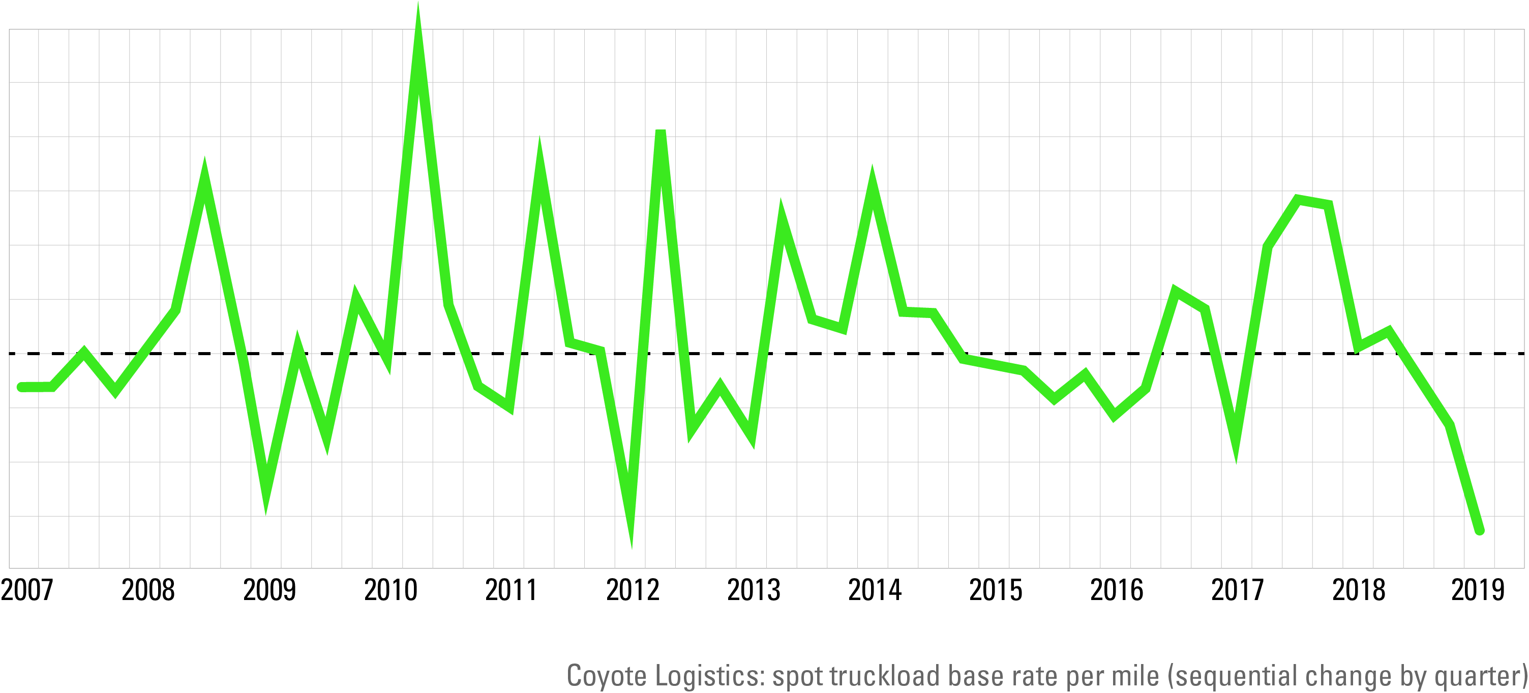
What if we measure the relative change in spot rates instead?
Does taking the same data set and examining the sequential rate of change yield a more useful view of market activity?
Not really. It does debunk a few common market myths, such as, “it’s always softer in January and February” or “it’s always tighter in June and July.”
As we can see, sometimes Q1 is deflationary to Q4 as peak retail shipping dies down, but sometimes it isn’t (i.e. 2014 & 2018).
Sometimes Q2 and Q3 are inflationary to Q1 due to summertime seasonal demand, and sometimes they aren’t (i.e. 2009 & 2015).
While this data view also illustrates the magnitude of rate volatility from quarter-to-quarter, but beyond that, it isn’t particularly useful.
What if we try to neutralize seasonality?
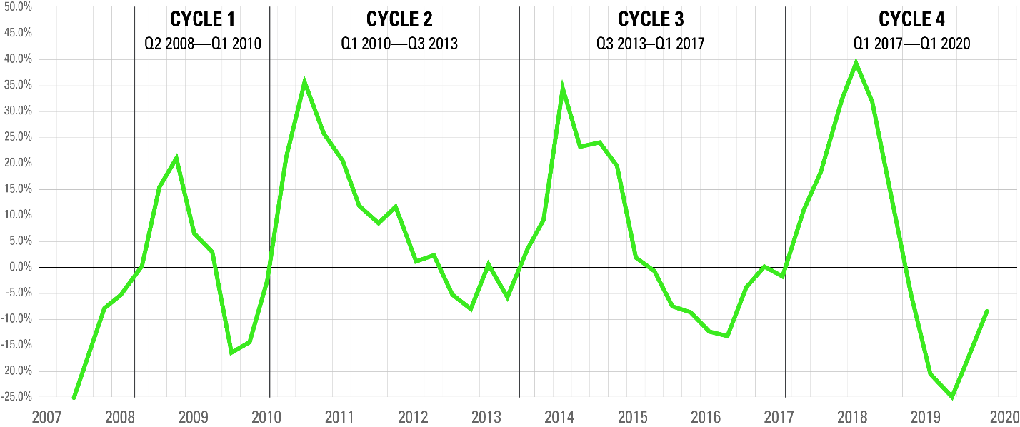
We took the same data set, but instead of mapping the sequential change from quarter-to-quarter, we look at the annual change, comparing each quarter to the same time frame the prior year.
Here we see a clear pattern emerge. We call it the market capacity cycle, and we measure it using the Coyote Curve.
How to Interpret the Coyote Curve: Definitions
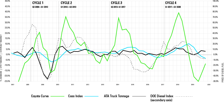
Since 2007, we’ve identified four distinct market capacity cycles, and are in the fifth (as of early 2021).
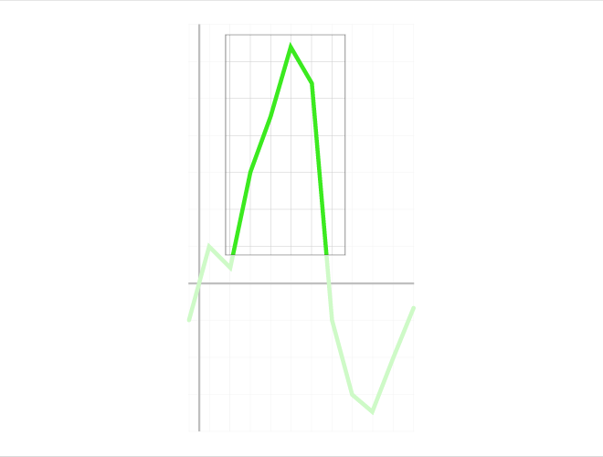
One complete market capacity cycle starts at equilibrium (0%), goes up to an inflationary peak, drops from the peak down to a deflationary trough, then back up to equilibrium (0%).
Let’s take a look at what’s typically happening during each phase of the market cycle.
Inflationary Market
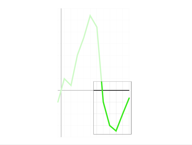
When the green Coyote Curve line is above the x-axis (y > 0%), we are in an inflationary market, which simply means that the rate of change in spot rates is higher than the same quarter in the previous year.
Generally speaking, shipper demand outpaces carrier supply, causing spot rates to accelerate higher and faster than contract rates. Primary tender acceptance and service levels will decline.
Rates remain high enough, long enough, that existing carriers add more capacity while new carriers enter the market.
Eventually, too much capacity enters for relative demand, the line peaks and beings to deflate.
Shipper demand exceeds carrier capacity.
Equilibrium
When line is at the x-axis (y = 0%), there is no change in spot rate activity versus the same quarter last year, and the market has reached a short-lived state of equilibrium.
Carrier supply and shipper demand are effectively balanced.
Deflationary Market
When the line is below the x-axis (y < 0%), we are in a deflationary market, which means that the rate of change in spot rates is lower than the same quarter in the previous year.
Generally speaking, carrier capacity exceeds relative shipper demand, causing spot rates to drop faster than contract rates. Primary tender acceptance and service levels will both be high.
Rates stay low enough, long enough, that capacity is forced to exit the market, whether it’s parking trucks, letting drivers go, cancelling orders or trucking companies going bankrupt altogether.
There is surplus carrier capacity relative to shipper demand.
How We Validate the Coyote Curve Model
The Coyote Curve sounds well-and-good if we just look at our own data, but we don’t operate in a vacuum.
Unless we cross-reference our model against other indicators, it isn’t a reliable forecasting tool.
Let’s take a look at three other indexes we use to verify the Coyote Curve.
- Cass Truckload Linehaul Index (contract rate proxy)
- ATA Truck Tonnage Index (demand proxy)
- DOE Diesel Index (supply proxy)
Contract vs. Spot Rates
Up to this point, we’ve only talked about the market capacity cycle in the context of spot rates, primarily because they paint the clearest picture of the current supply/demand balance.
What about contract rates? After all, the annual procurement cycle is one of the three cycles that characterize the truckload market.
We use the Cass Truckload Linehaul Index as a proxy for contract rate performance.
Cass is the nation’s largest payer of freight bills, managing nearly $30 billion in annual freight spend.
Shippers with enough freight spend to outsource payables are, generally speaking, the same shippers with enough truckload volume to secure annual contract pricing in a bid.
Cass is the nation’s largest payer of freight bills.
As such, a majority of the Cass index is comprised of contract rates (aka primary or annual rates).
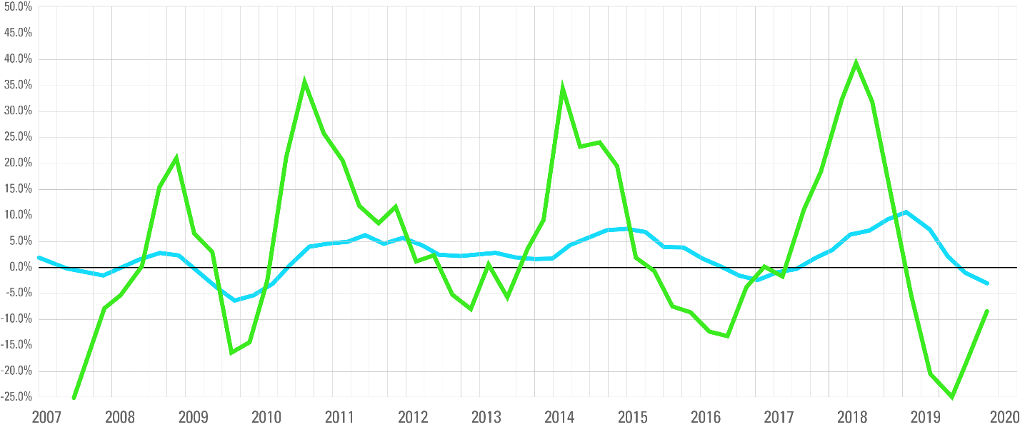
Let’s examine the Coyote Curve up against the Cass Truckload Linehaul Index, again measuring the rate of change in each quarter versus the same quarter in the prior year.
Compared against our contract rate proxy, the Coyote Curve model holds up.
The Cass Index takes the same general path as the Curve, though its peaks and valleys are far less pronounced (+5%-10%) versus the spot market (+35-40%).
This checks out, given the comparative “stickiness” of contract commitments, meaning that carriers will generally move the freight they won in the bid at the contract rate, regardless of spot market activity (most of the time).
We can also observe that the Coyote Curve consistently leads the contract line in both directions, which also makes sense.
Annual bid cycles are naturally much slower moving than real-time spot pricing. Also, recent market conditions heavily influence both shippers’ and carriers’ forward-looking predictions during an annual bid.
The Coyote Curve consistently leads the contract line in both directions.
To put it another way, if spot rates were really low and capacity was widely available leading up to an annual bid (like in 2016), shippers are going to push down carrier rates even if the market is already starting to tighten (see 2017).
If, conversely, spot rates were really high and capacity was really tight leading up to a bid (like in 2018), carriers are going to push for rate increases in the bid, and shippers will likely give it to them, even if the market peak has already passed (see 2019).
Supply and Demand
Truckload rates, both spot and contract, are really just a classic tale of supply and demand. To continue building conviction in the Coyote Curve, we look for other indicators that can serve as proxies for those two forces.
Demand:
We use a monthly Seasonally Adjusted Truckload Tonnage index, published by the American Trucking Association (ATA).
The ATA is the largest national trade association for the trucking industry, and it calculates the tonnage index based on surveys from its expansive membership.
Truckload rates, both spot and contract, are really just a classic tale of supply and demand.
In such a large, fragmented industry, there is no single source of truth to measure the overall freight demand in the U.S., but the tonnage index covers enough of the market to serve as a decent proxy for the overall change (up or down) of truckload volume moving each month.
Supply:
Unfortunately, there isn’t a great proxy for the number of Class 8 semi-trucks in active service, so we’ll have to be resourceful.
Diesel fuel tends to account for approximately one-third of a carrier’s fleet cost and is much more volatile than the third that goes to driver wages and benefits.
We use diesel price activity relative to the spot rate environment as an indicator of carriers’ financial health.
If fuel costs spike faster than rates (as in 2007–8), carriers will face additional financial pressure, and some will be forced to shrink, idle or exit the industry altogether.
Unfortunately, there isn’t a great proxy for the number of trucks in active service, so we’ll have to be resourceful.
On the other hand, if fuel prices deflate faster than rates (as in 2014–15), carriers will have more financial flexibility to absorb lower market rates.
When we overlay our spot and contract rate curves with our supply and demand indicators, we can observe some coincidental behavior.
When demand and fuel are accelerating simultaneously:
- Conditions are ripe for an inflationary truckload rate environment, as carriers will push for even higher rates to offset the fuel spike.
When both are simultaneously decreasing:
- Conditions support a deflating rate environment, as carriers have relatively more leeway to absorb lower and lower rates.
Fuel volatility is especially problematic (or beneficial) for smaller carriers, which make up 97% of trucking companies.
Why? Carriers with fleets large enough to secure awards on a shipper’s annual bid will have base contract rates, and a floating fuel surcharge determined by a fuel surcharge matrix.
Fuel volatility is especially problematic for smaller carriers, which make up 95% of trucking companies.
This will somewhat shield larger carriers from fuel swings. Smaller carriers, who operate almost exclusively in the spot market, are far more reactionary to diesel increases (or declines).
Though we make no claim of statistical causality, they are useful in signaling inflection points.
Other Indicators We Use
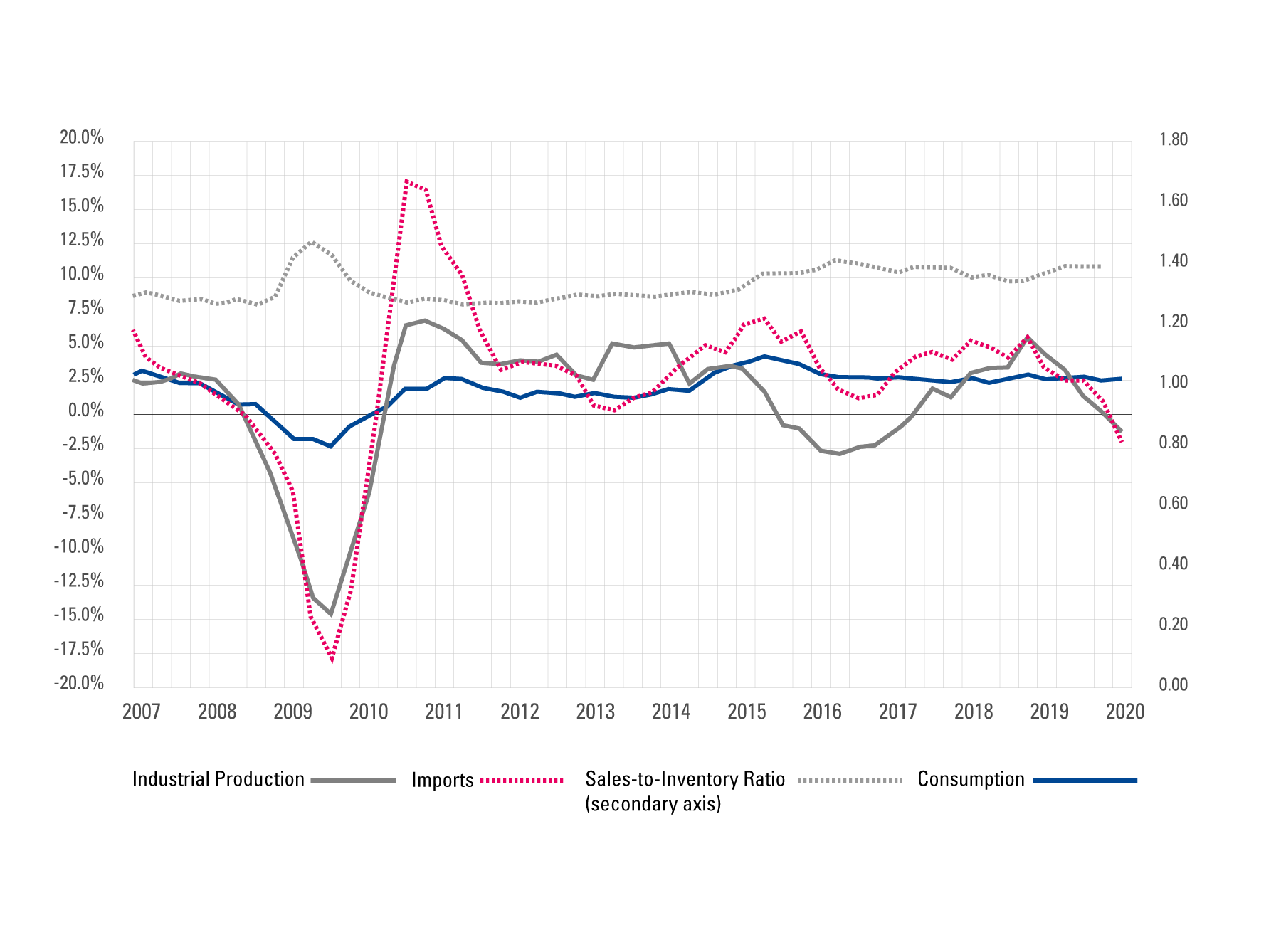
We’ve covered the core contract, supply and demand indexes we use validate our model, but we also use several other indicators to further vet the Coyote Curve, including:
- Industrial Production (IP)
Published by the Federal Reserve Board - Imports
Published by the U.S. Bureau of Labor Statistics - Consumer Spending (Consumption)
Published by the U.S. Bureau of Economic Analysis - Sales-to-Inventory Ratio
Published by the U.S. Census Bureau - Class 8 Truck Orders
Published by ACT Research
Validating the Curve Over Time
The most important endorsement of the Coyote Curve is its proven accuracy over time.
Though many market participants felt 2016 was an extremely “soft” year, we correctly predicted that the curve would reach an inflection point and trend upwards.
When back-to-back hurricanes devastated southern coastal regions in late 2017, shippers felt the capacity crunch like a lightning bolt.
In reality, the market had been trending towards an inflationary environment since Q2 2016 and crossed the threshold in Q1 2017, many months before the wider industry acknowledged it.
We’ve seen this cycle play out quarter after quarter, year after year, even during unprecedented conditions driven by COVID-19.
The most important endorsement of the Coyote Curve is its proven accuracy over time.
Using the Coyote Curve in Your Business
All shippers and carriers are, at least to some degree, impacted by the ebbs and flows of the market capacity cycle.
Exactly how the market will impact your business will vary based on your business type, size, strategy, etc.
Whether you are a Fortune 500 retailer securing contract rates in a massive annual procurement event, or a five-truck carrier contemplating adding another tractor, having a basic understanding of where the market is heading is extremely beneficial.
The Coyote Curve is a clear, useful tool that all businesses can use to understand the U.S. truckload market.
Now that you are an expert on both the U.S. truckload market and the Coyote Curve forecasting model, check out the most recent market update and forecast.
You can also view past guides and webinars, and read how other businesses apply the Curve to their operations, by visiting the Coyote Curve hub in our Resource Center.


